15 menu items. Where do you start?
Gallery, Gallery 2, an empty forum, a booking page with nothing to book… If visitors can’t find it right away, they’re gone.
Same craftsman. Same photos. Same story. Only now: a website that finally shows what he’s really worth. This is how we gave carpenter BeMen’s site a fresh look — drag below and see the difference.
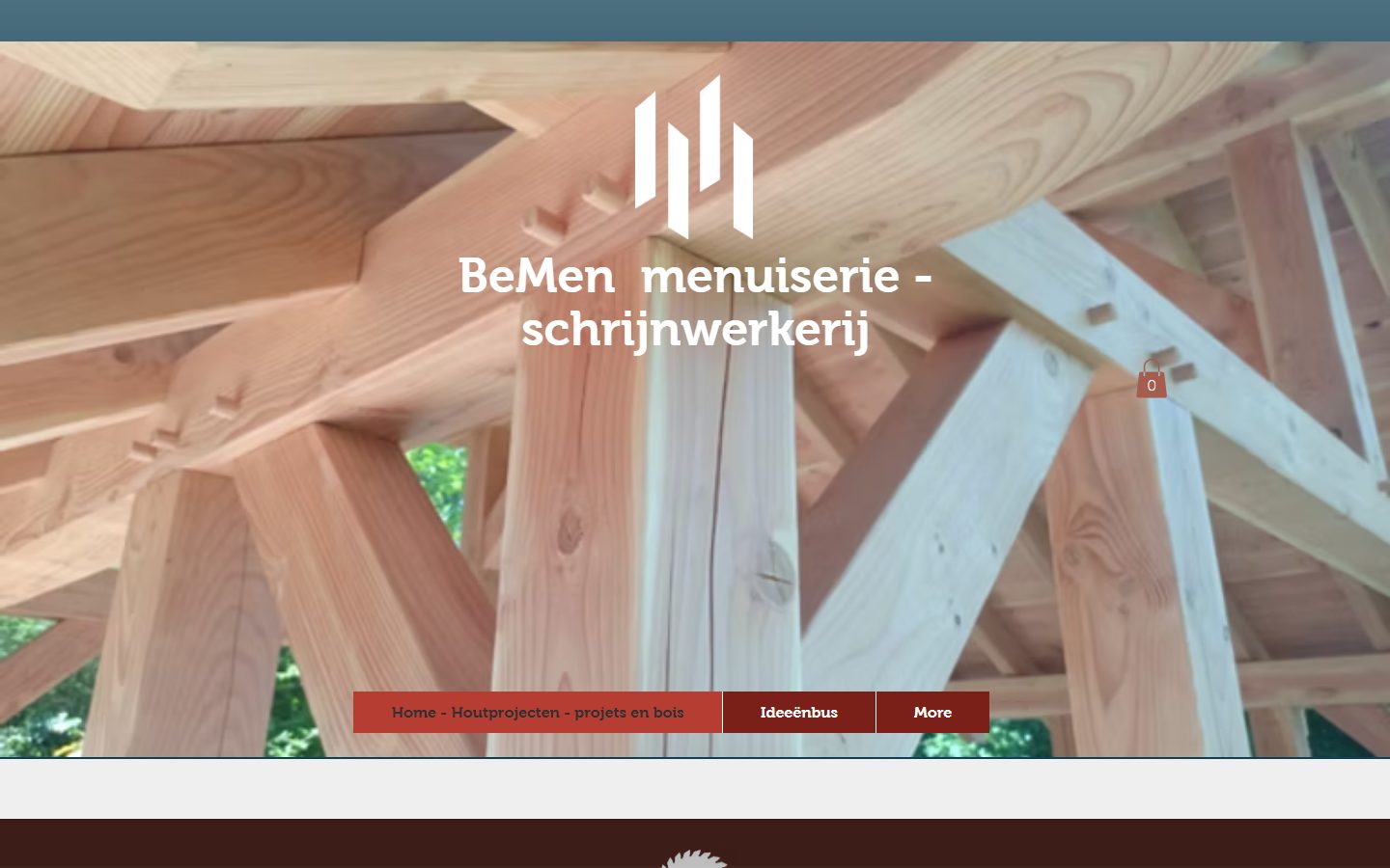
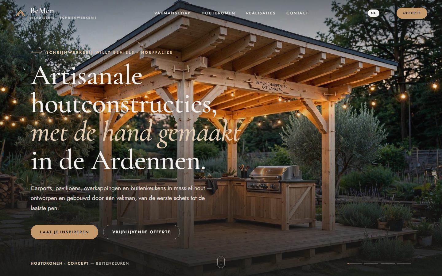 Before
After
Before
After
← Drag → to compare old and new
A craftsman with beautiful work — and a website that showed none of it. Nothing to be ashamed of: that’s simply how sites grow, page by page, year after year. Until visitors leave before they’ve seen a single photo.
Gallery, Gallery 2, an empty forum, a booking page with nothing to book… If visitors can’t find it right away, they’re gone.
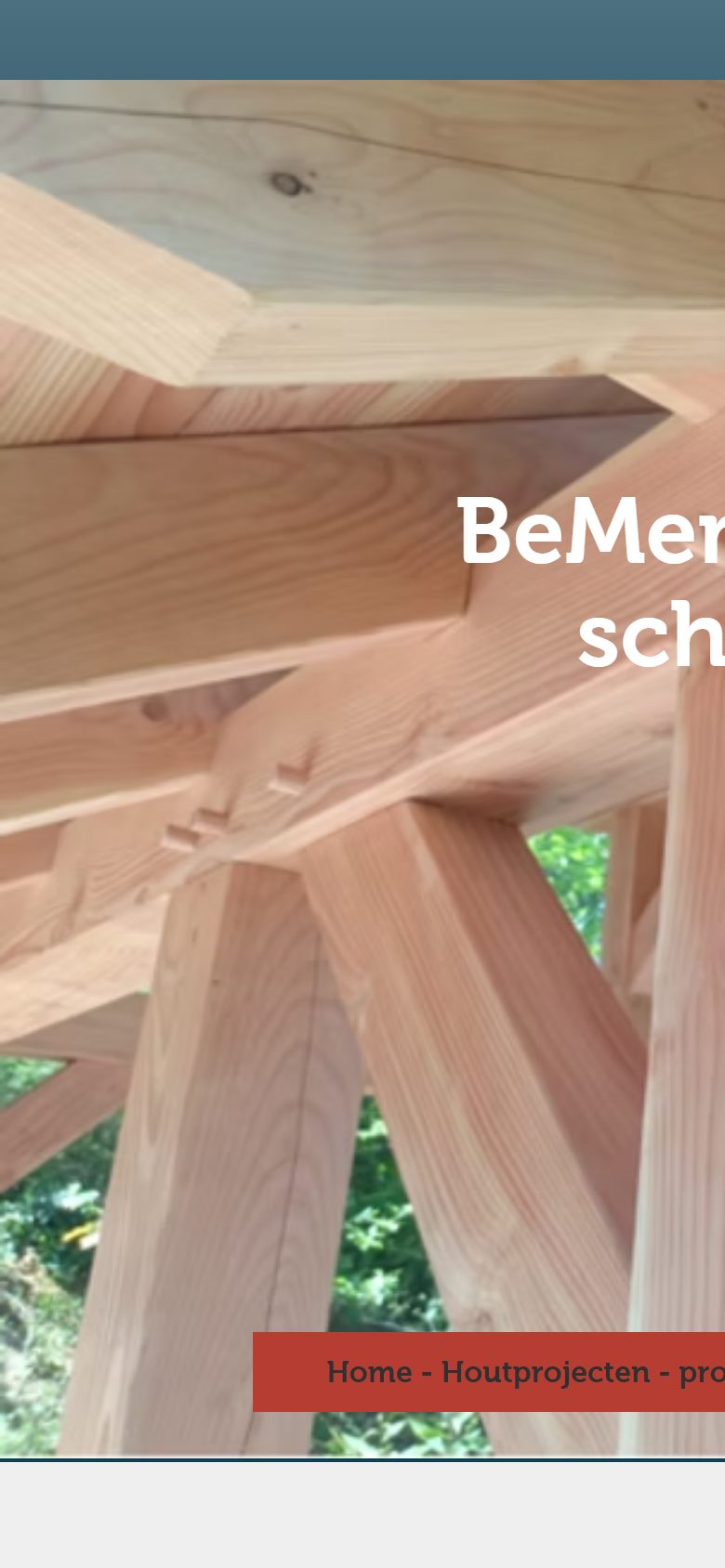
No mobile version: the name half cut off, the menu off to the right. While most customers search on their phone.
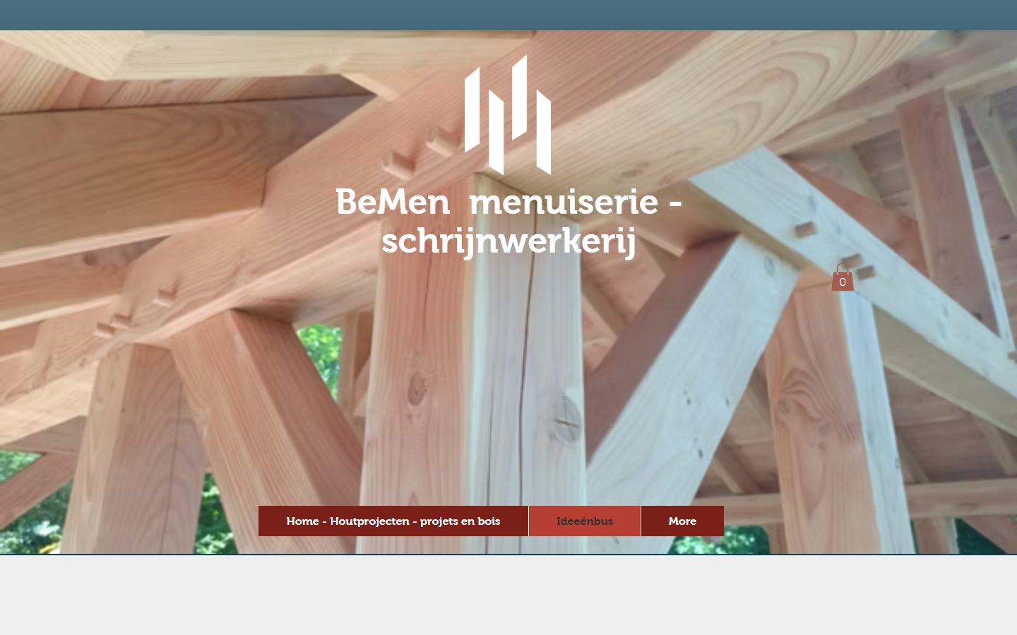
Great idea, empty page. His best designs were only shared on Facebook — where they sink out of sight within a day.
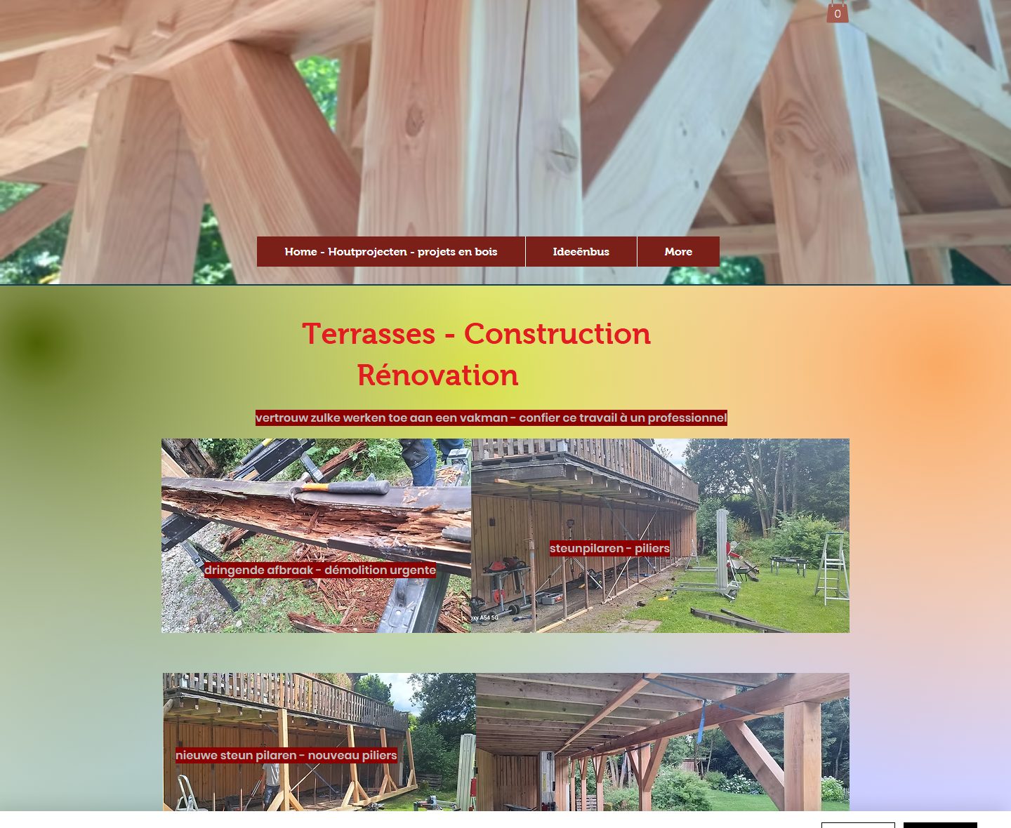
Dutch and French in the same sentence, rainbow backgrounds, text over photos. The work is strong — the packaging undermined it.
Sounds like your site? Good news: your content is often worth its weight in gold. It just deserves a better stage.
Full-screen images that slowly fade into one another, a headline that says what he does in one sentence, and two clear buttons. Within three seconds every visitor knows: this is the place.
The client wanted to move away from renovation towards handcrafted timber building. The site now tells exactly that story.
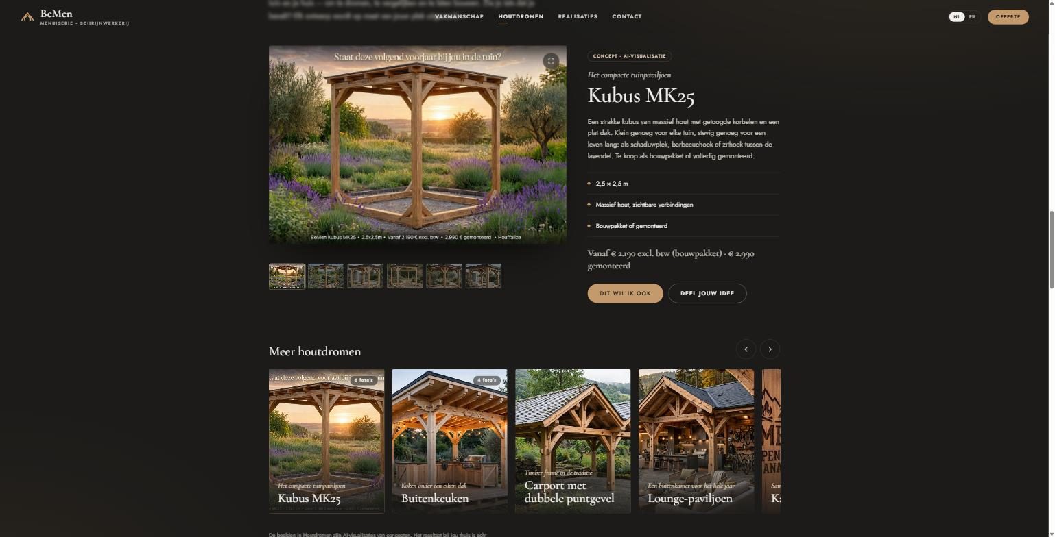
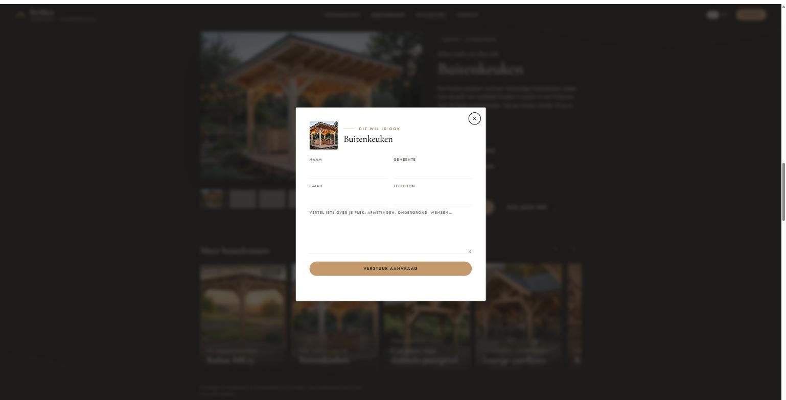
We named it Houtdromen (“wood dreams”): a showcase of designs to dream about, in big images and a smooth carousel. Every design has one button: “I want this too” — and the request lands with the craftsman.
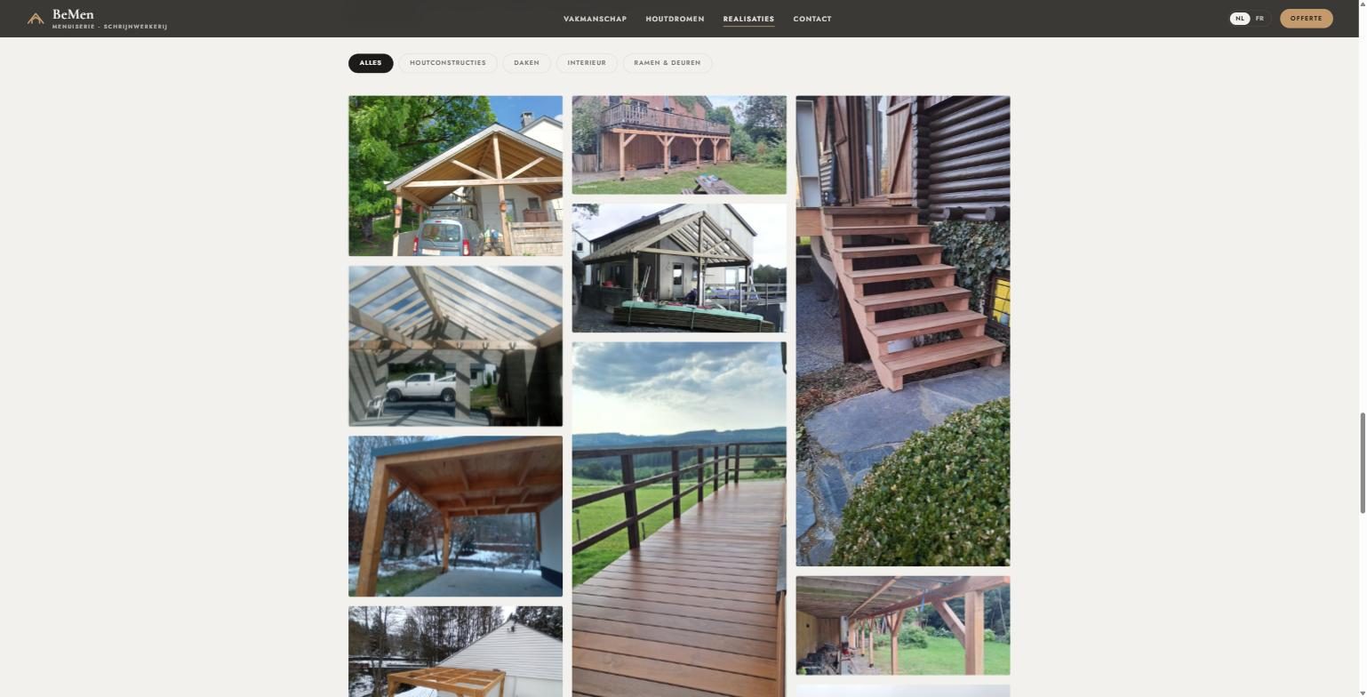
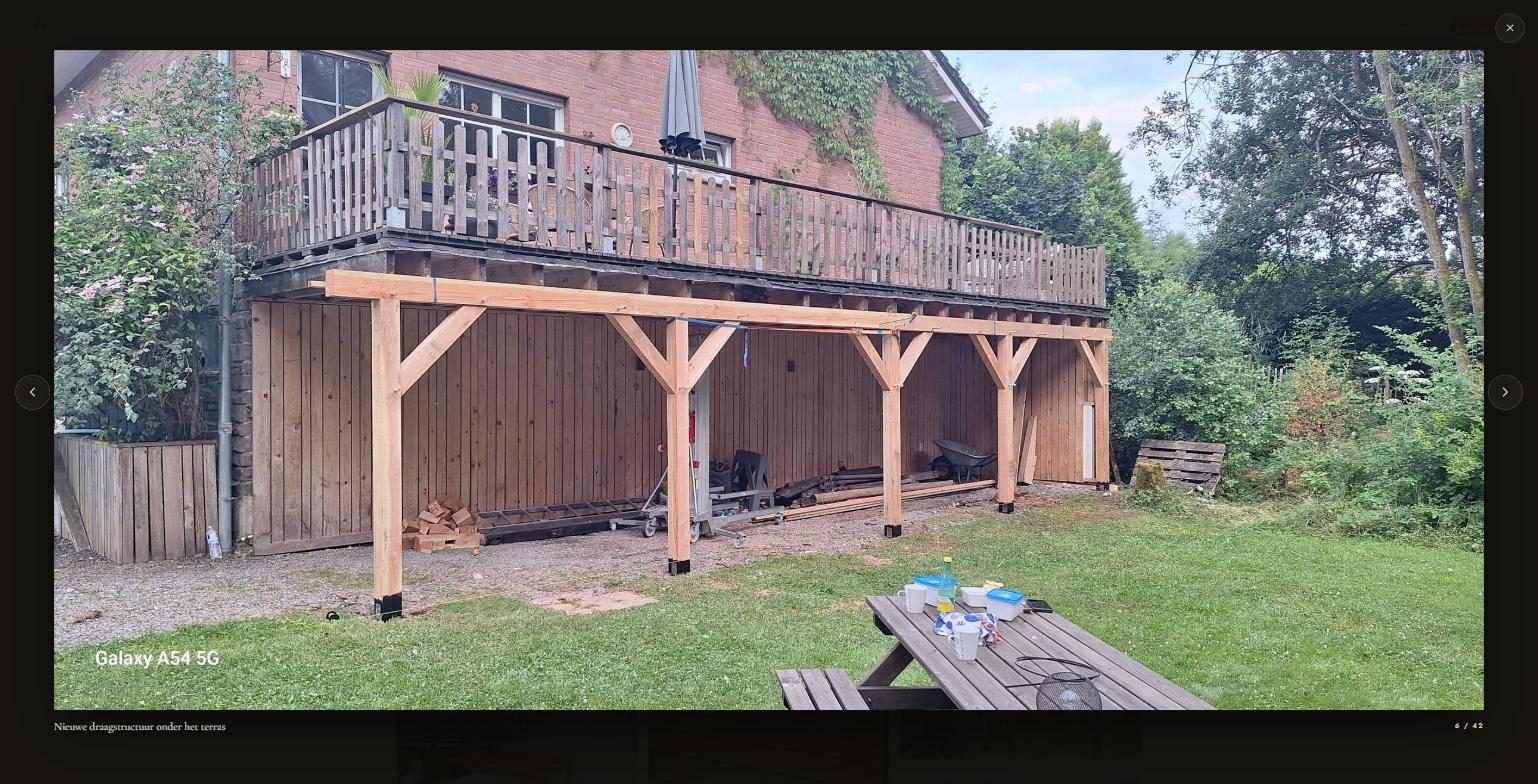
We retrieved every photo in the highest quality available, sorted them and cut the noise. Two gallery pages became one elegant wall with filters — click and every photo opens full screen.
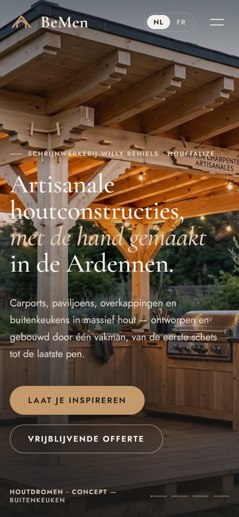
Same site, same moment, same phone. Spot the difference.
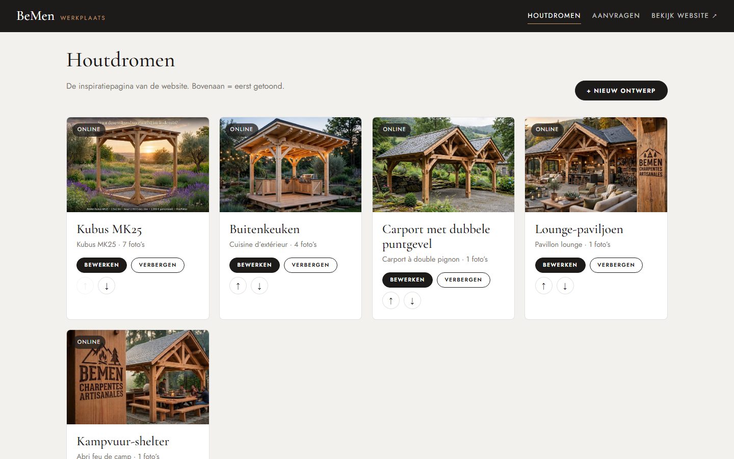
Putting a new design online? Drag in the photos, type a title, save. Every quote request and submitted idea arrives neatly in one overview — photos included.
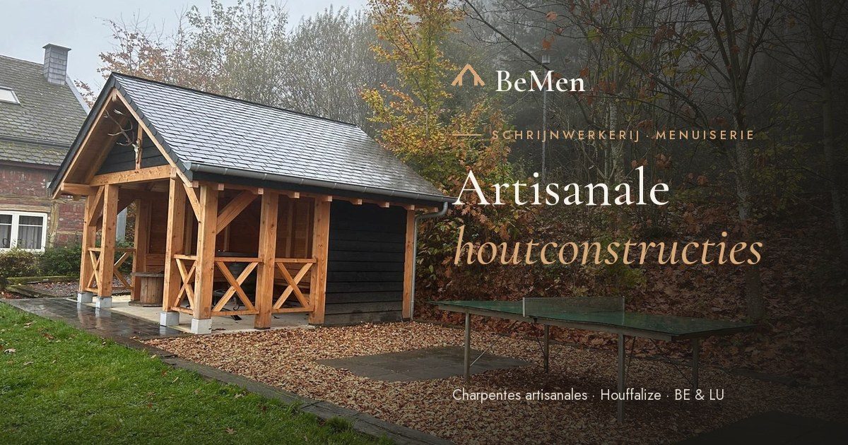
Every shared link now shows a polished preview with logo and title instead of a random crop. Plus its own little icon in every browser tab. Small details — a big difference in how professional you come across.
You don’t have to start over. Your content stays, your address stays — we give it a shape that wins customers over. Your new site is usually online within a week.
Send us the address of your current site. Within a week you’ll know what it could look like.